

Hulu is a well known streaming platform that provides content in the form of TV and movies. Known for its more adult-oriented programming towards that of the Baby Boomers to the Gen Z demographic, Hulu has grown in revenue with over 39million subscribers and over 85,000 shows. However, Hulu has some pain points when utilizing it on different platforms. In this sprint developed during my time in the Emerging Media Masters program at the University of Georgia, my team and I address these pain points.
In order to redesign Hulu’s platform, my team and I had to first figure out the issues the application had, how we would address them, and when the deliverables will be finished for testing.
Through our ideation period, we considered:
As we answered the above questions, we were able to figure out our journey map and target area of the customer journey as well as our scope of focus being for web and tablet view.
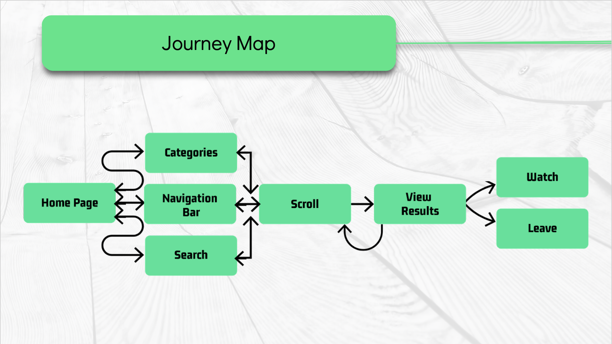
From there, we came up with some “How might we?” questions to better ideate solutions in terms of organization, information, user behaviour, and site consistency for our crazy 8’s and our low-fi sketches. My team and I each designed our own flows which then led to silent voting of the best features and ideas we could incorporate in our overall design.
Deciding on member roles in the beginning, we then divided the sections with a focus for each designer to make in the overall prototype. I was tasked with designing the landing, login, and the search portion of our project. You can view the raw un-prototyped design optimized for web and tablet view below.

Additionally, I also had to find poster images of TV shows or movies we could use for our search results as well as designing the overall slide deck. I was able to accomplish both tasks using adobe photoshop and we utilised google slides to input the information on top of the slide designs I made.
Finally, we were able to run a user test with five participants ranging from age 18-25 to test the prototype. We learned that there was success in addressing customization and reduction in the learning curve of the Hulu homepage. We found some confusion with our tag groupings, but learned that we need to be more clear in our classifications and groupings. For the final prototype, you can view it within our team’s final presentation below.